

Responsive web development services ensure that your website loads well everywhere in proper format including all your important content completely visible. Get a free quote by us today!
Plenty of responsive web development services are there worldwide. Every website on the Internet follows the Responsive web design criteria as there are many platforms which will be used to discover your platform and it is important that your site loads well on each one of them.
There are many devices with different screen sizes and if your website does not load in proper format with images, buttons, and other elements in place, then your user will not give time there and run away instantly. Following responsive web development practice is a must.
In this blog, we will learn why responsive web development matters.
Why Responsive Web Development Services Are Important?
Responsive web development services focuses on implementing specifics which include adjusting the site rendering for different screen sizes, tablets, laptop, and more.
A responsive website allows you to only have one site which can render your site properly on different screens and devices. A mobile friendly website directly impacts how easy it is for people to use your site and make you visible on Google ensuring your audience have access to every information you present on the site.
If your website is not responsive it fails to load properly on different screen size devices which directly impact your people's trust, engagement, and possibly impacting your business from online visibility.
Responsive Web Development Services: Desktop Vs Mobile
Imagine you have a website which renders great on a computer i.e. Desktop. The desktop version generally contains a wide navigation menu, three-column layouts, large images, detailed content sections, and forms placed next to text.
Suppose you open the same site on your mobile device every element would simply become smaller. The text could be difficult to read, buttons would be harder to tap, and users might have to scroll sideways or excessively to find the information they need.
Simply all important elements which were rendering properly on desktop might not load properly on mobile. This will make it difficult to understand important information on site affecting users signups, downloads, or maybe even purchase. This will significantly impact users with commercial segments.
This is where responsive web design steps in. Responsive design allows a website to automatically adjust its layout, content, images, and navigation based on the user's screen size. Instead of displaying the desktop layout on a smaller screen, the website reorganises its elements to provide a better mobile experience.
For example:
| On Desktop | On Mobile |
|---|---|
| Three-column content layout | Content changes to a single-column layout |
| Full navigation menu across the top | Navigation becomes simpler and easier to use |
| Large images and content sections | Images resize to fit the screen |
| Forms and text displayed side by side | Buttons become larger and easier to tap; content is arranged in a more natural scrolling order |
The main purpose of responsive web design is simple: your website should be easy to read, navigate, and use on every device, whether someone is visiting from a desktop, tablet, or smartphone.
Why Does Your Business Need a Responsive Website?
Well, a responsive website is an important checkmark that you must ensure you have whenever you are building your online landing site. In today's digital world there are plenty of devices and platforms where users will be landing on your site.
A website with responsive web development features ensures that your website fits exactly as it needs to be in the available window making all the important elements including your CTA, buttons, headers, and content visible exactly like you need them to be. Let us understand some of the reasons mentioned below.
- Customers have different devices on which they might be accessing your site. Like someone might find your site sitting on a laptop or someone while playing a game on their tab when they decide to multi-task a little.
- Mobile users need smart navigation controls fitting in the small available window so that navigation, forms, details and calls to action are easy to find and use.
- Responsive web development Services ensures a better user experience which might get you better conversions as users who land on your website can easily navigate and spot the service.
A website with responsive design is easier to navigate. For example, if it is an ecommerce business people from different devices can easily find the cart and option to pay and complete their purchase.
Product Selected → Product Page & Description → Cart → Checkout
A website not having responsive design taken care before deployment might make it hard for their users especially when it comes to conversion or earning trust.
How Responsive Design Might Actually Be Good for Your Website Performance?
Responsive web development services ensure that your website fits on whichever screen it loads including small screens.
And when every element loads properly like shrinking an 1084x547px image on a laptop to 546x200 to ensure it is visible properly is something you can call responsive web design. Let us get it with one more example.
Suppose a button is having the following dimension on a desktop device.
- Width: 140px
- Height: 45px
- Text: 45px
With responsive feature enabled it can load the same button in a different dimension
- Width: 90–100% of the available space
- Height: 50–55px
- Text: 16–18px
Let us get it with a simple CSS example below.
.button {
  padding: 12px 24px;
  font-size: 16px;
}

/* Adjust button for mobile screens */
@media (max-width: 768px) {
  .button {
    width: 100%;
    padding: 15px;
    font-size: 18px;
  }
}
It helps with the SEO part too making the website have a better mobile user experience. If slow loading is the main worry, our performance focused website development service looks at page speed and Core Web Vitals.
What Does Responsive Website Improve?
A responsive website design ensures that your users are getting the information you want them to give.
For example, if you have a small local business then you have the following important elements.
- Phone number
- Services
- Whatsapp Button
- Location
- Map Direction
And if you are running an online business then the following are important elements for you
- Product images
- Add to cart button
- Delivery information
- Payment Options
Similarly, based on the business you have and the people you want to reach it gets easier with responsive web design. It does no magic, it just ensures that your site renders every important information perfectly irrespective of the device it loads on.
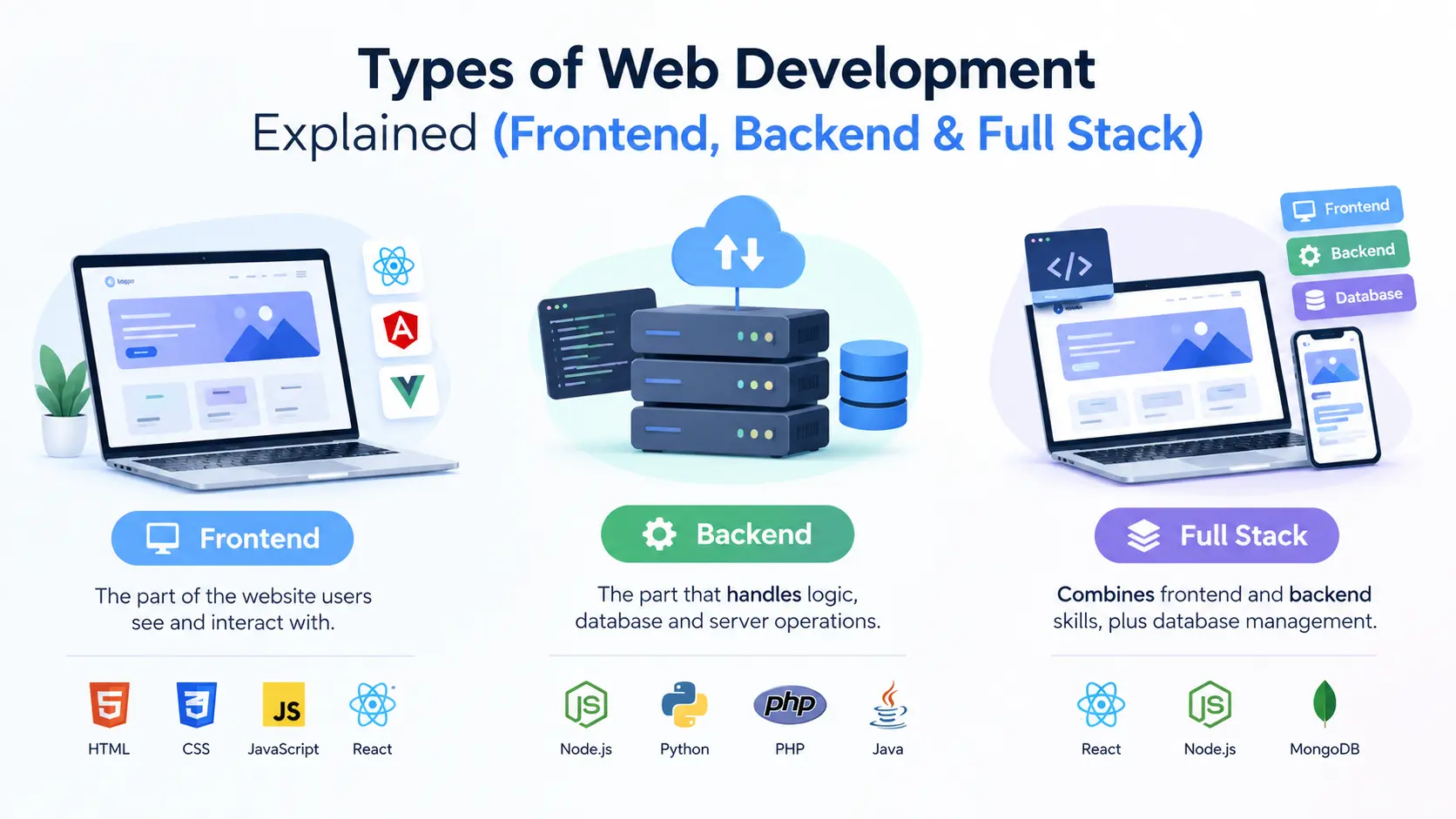
Also Read: Types of Web Development Explained
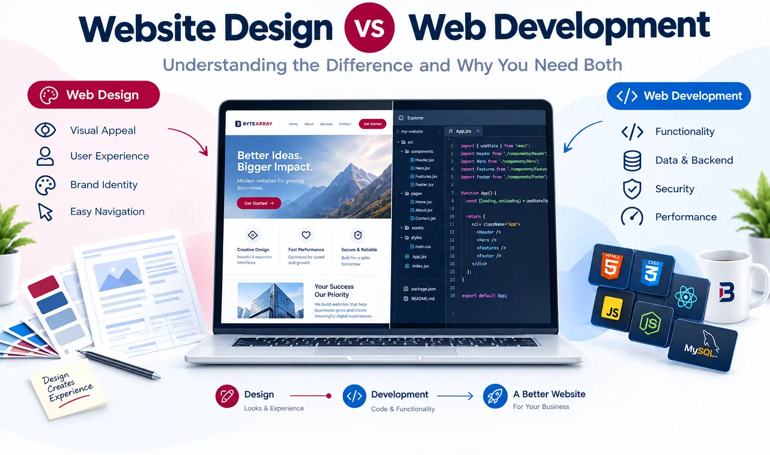
Also Read: Website Design vs Web Development
Get a Perfect Responsive Web Development Services With ByteArray Solutions
Every website we deliver at ByteArray is responsive. We double check and ensure your website lands properly on all devices irrespective of their screen size. Call us and get a free quote today!





Leave a comment